Would you like to get in touch? Then please fill the contact form below and I will contact you as soon as possible.
Horizon Europe
Page currently under maintenance.
Horizon Europe (former Horizon2020 or H2020) is the ninth Framework Programme for Research and Innovation in the European Union, with a budget of more than €95 billion. The programme is built around three main pillars – excellent science, global challenges and industrial competitiveness, and innovative Europe.
Five missions relating to climate change, cancer, oceans and water, carbon-neutral cities and soil health, also form an integral part of Horizon Europe.
Horizon Europe offers a broad range of funding opportunities, from support for basic scientific research to application-oriented projects and market launch activities. The funding is aimed at individual researchers, small and larger consortia and companies, especially SMEs, in all fields.

Project insights
As a Design Consultant I have assisted in the development of visual identities for over 60 projects ranging from refugee integration to new fuel technologies. These projects have a lifespan of 3-5 years and their main challenges are the tight schedules and mostly modest budgets for design and visuals.
Assignments of this kind usually include the creation of a visual identity (logo, colors, typography, etc.) and in some cases additional components such as web design or the design of print media (flyers, posters, magazines, etc.).
The following project references of the past years display insights of my expertise in these areas.
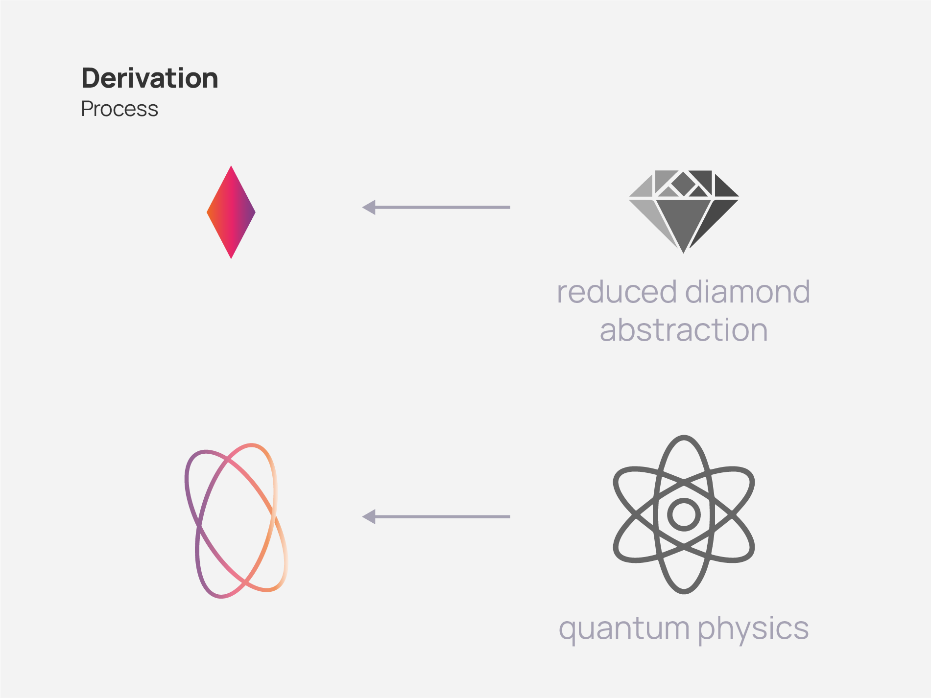
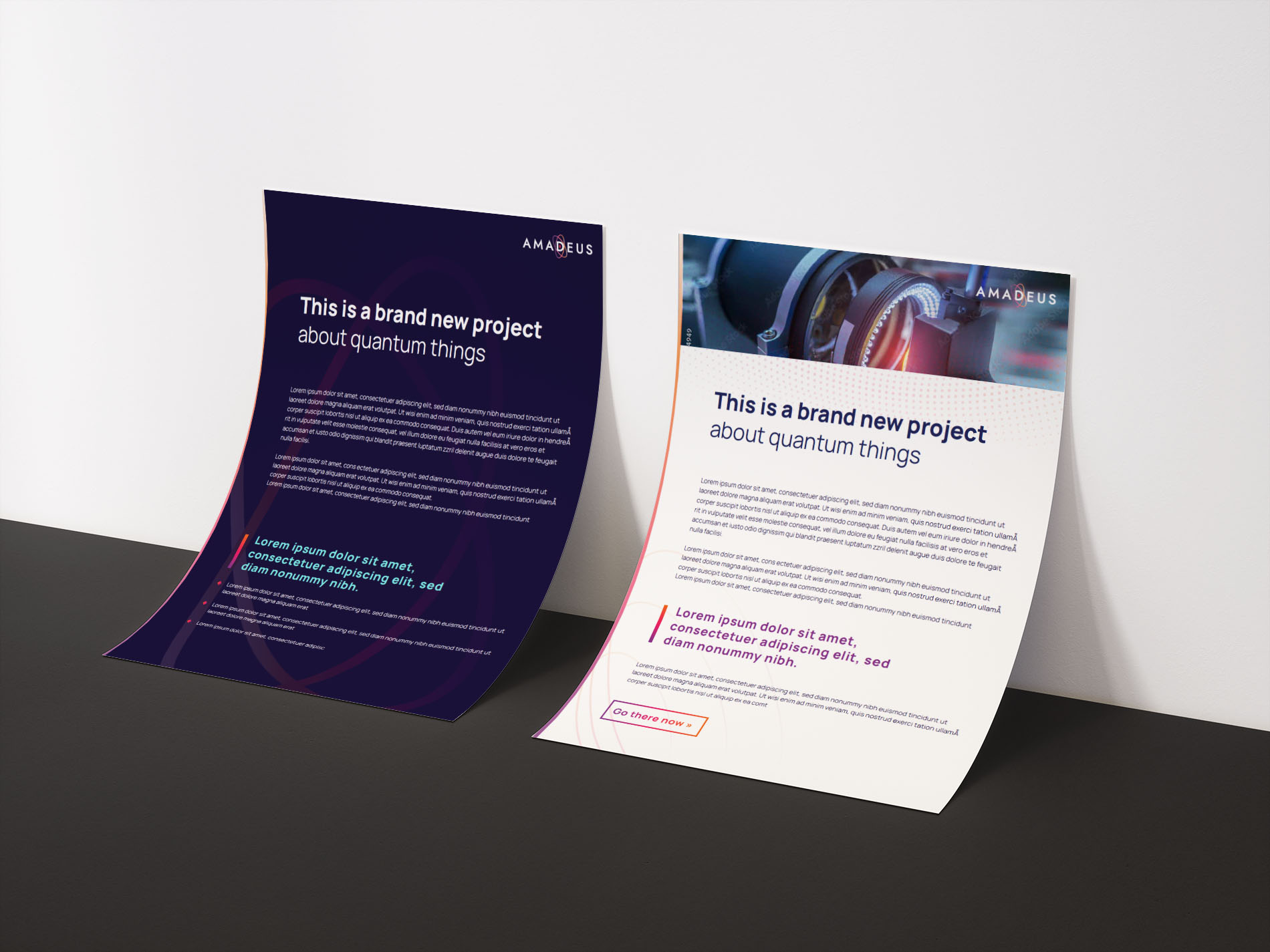
AMADEUS
AMADEUS is an industry-oriented consortium involving large companies, RTOs, SME’s and academic partners. The project targets the market uptake of quantum sensors exploiting Nitrogen-Vacancy (NV) centres in ultrapure diamond crystals. NV centres in diamond is the core element for robust quantum sensing which enables disruptive technologies for a variety of applications ranging from novel tools for the semiconductor industry to novel ways to measure and analyze brain functions.
Logo
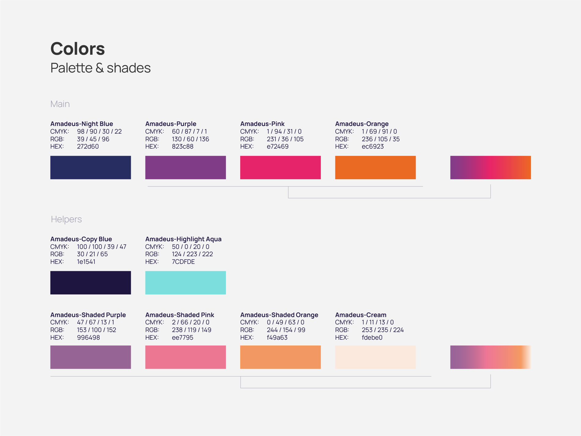
Important aspects to include in the logo for AMADEUS during the ideation process were the concepts of diamonds and quantum physics as well as the use of a warm and cold color palette. The result is a mid-light logo with a clear typeface and organic but also strict graphical forms.
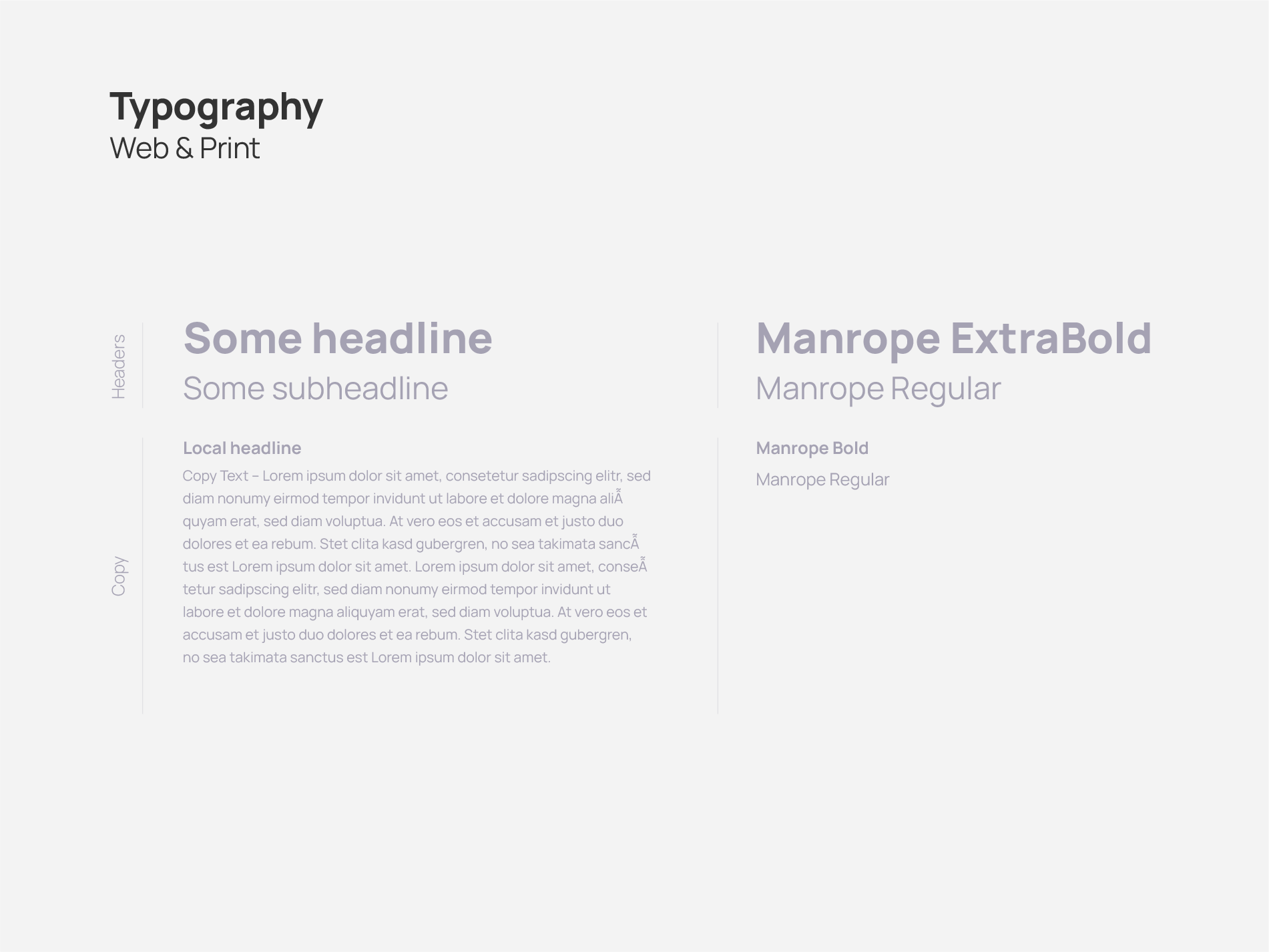
Visual Identity
A project visual identity consisting of logo, typography for web/print, editable documents and a color palette was developed. It also included a short exemplification of usage. The colors allow for positive-negative variations of the communication media which make the identity quite multi-faceted.
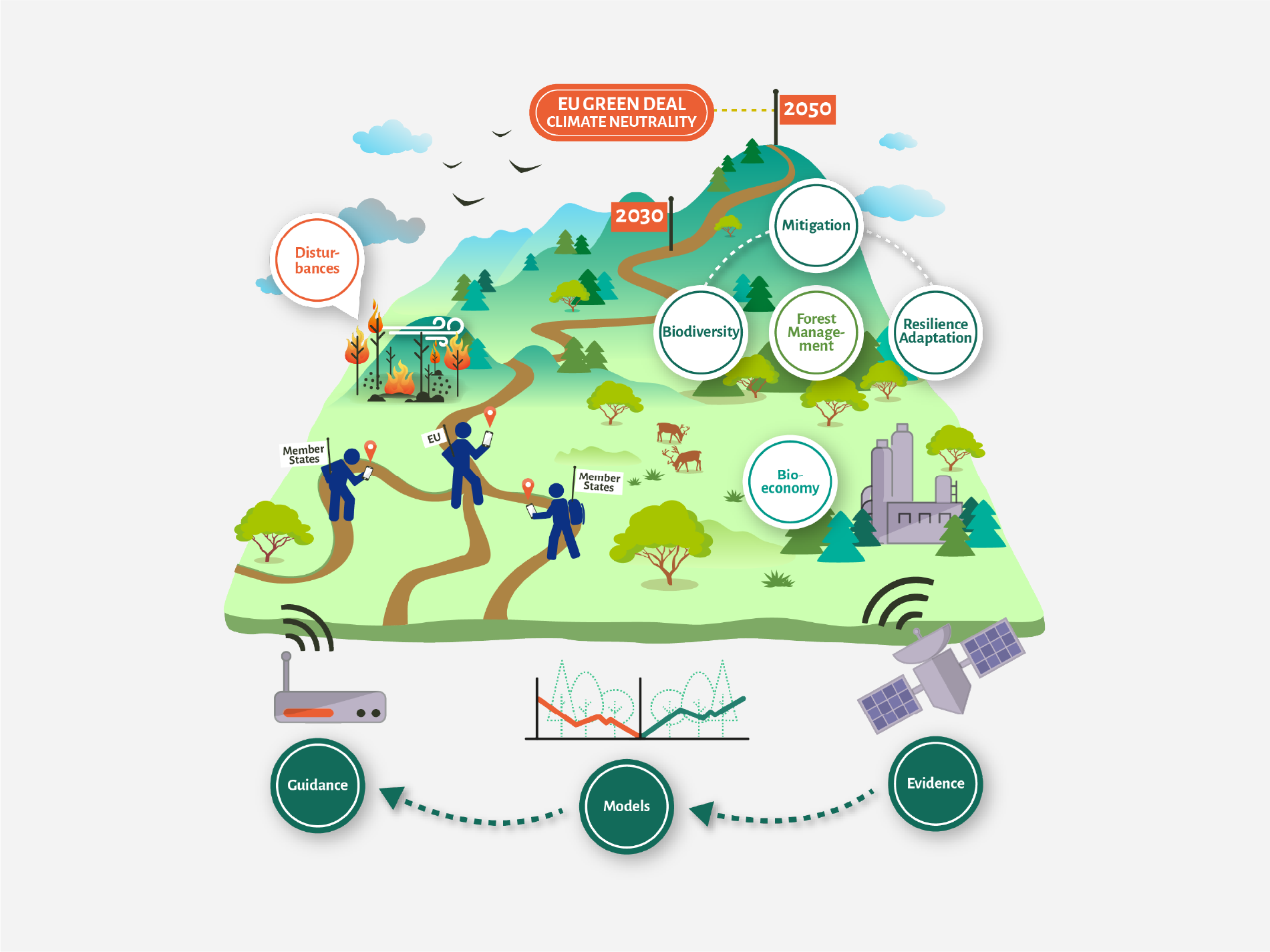
ForestNavigator
The ForestNavigator project assesses the climate mitigation potential of forests and forest-based sectors by modelling robust policy pathways aligned with medium (2030) and long-term (2050) climate goals. It uses integrated approaches combining observational data, policy expertise, and advanced modelling tools to develop a Policy Modelling Toolbox. The Toolbox relies on near-real time monitoring of forests, carbon, and biodiversity, and provides policy makers with efficient decision-making tools for climate action.
Logo
The main challenge regarding the logo creation for ForestNavigator was to develop new ideas for possible logo alternatives and also work on multiple variations of the already existing sketch of the project coordinator. The result is based on the original idea, displaying scientifically correct tree types that are relevant to the project, with a visual anchor point in the center in the form of a compass.

Webdesign
The aim of the overall design for ForestNavigator was to stay clean and fresh while having some elements standing out in a haptic, depth-rich look and feel, like having a piece of paper on a tabletop with multiple elements on top of it. Call-to-action and highlight areas are usually designed in warmer colors, while making use of the green palette for all other elements and sections.


Illustrations and graphics
As mentioned before, it was important for us to create a sense of depth across all media. To reach this goal we applied the same principle to illustrations as far as possible, trying to keep them flat and at the same time dynamic and deep by using gradients and shadows for overlapping elements.
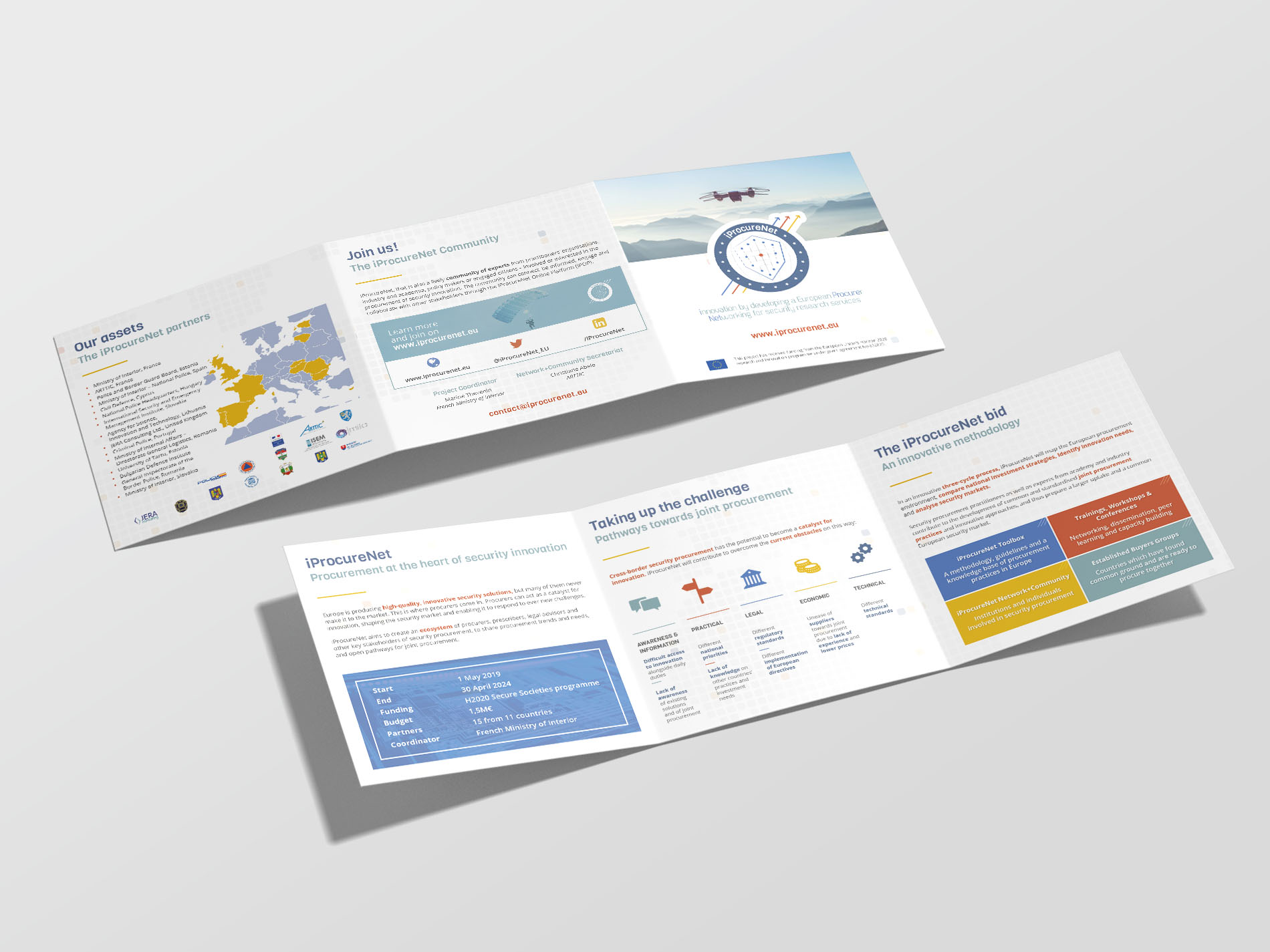
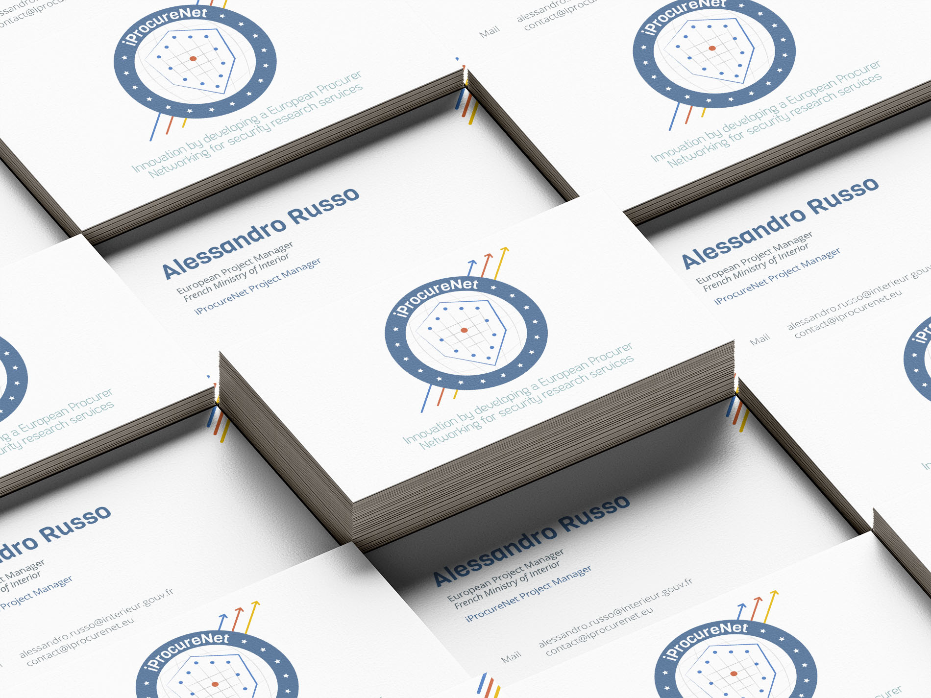
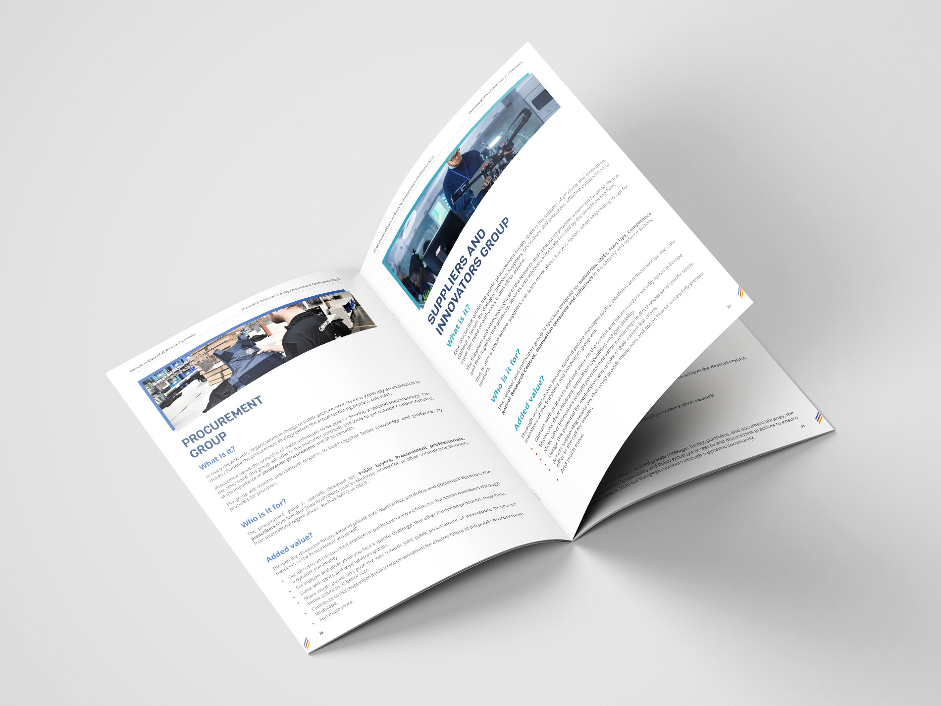
iProcureNet
iProcureNet aims to create an ecosystem of procurers, prescribers, legal advisors and other key stakeholders of security procurement, to share procurement trends and needs, and open pathways for innovation in procurement and joint procurement across EU member states. iProcureNet is a 5-year project running from May 2019 to April 2024 and funded by the European Commission.
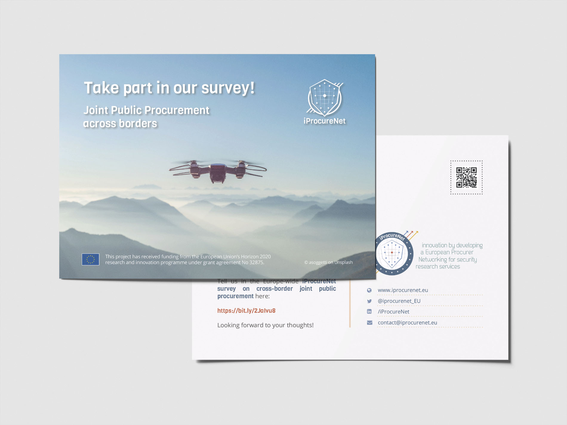
Print media
Based on the previously created visual identity, various print products were designed, including flyers, business cards, postcards and posters.
As the logo incorporates the main aspects "Network" and "Security" and is designed in a clear and technical way, these key points also are kept in the other designs to keep a consistent look of the brand.
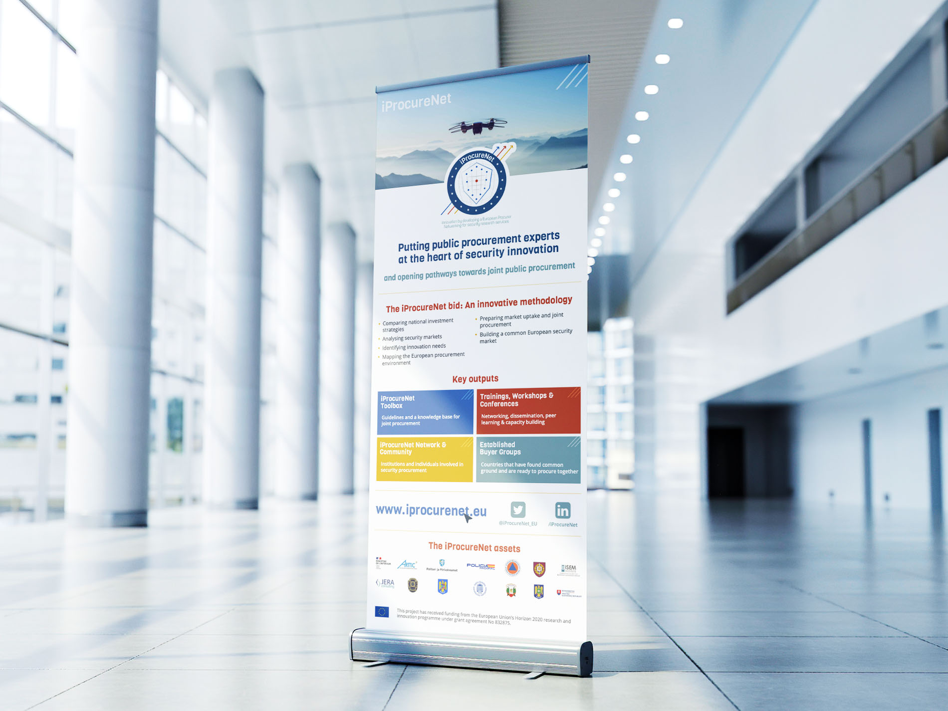
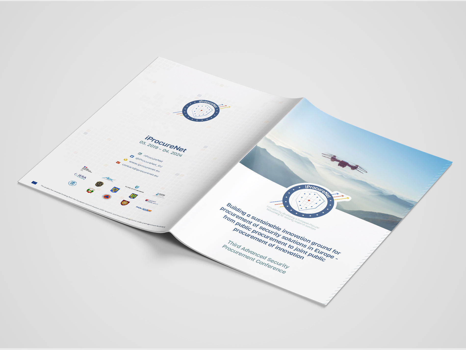
Conference media
As the project consortium organizes annual conferences, suitable extra branding products were needed for this purpose. The aim here is to present a sufficient amount of information on different formats as concisely and attractively as possible.
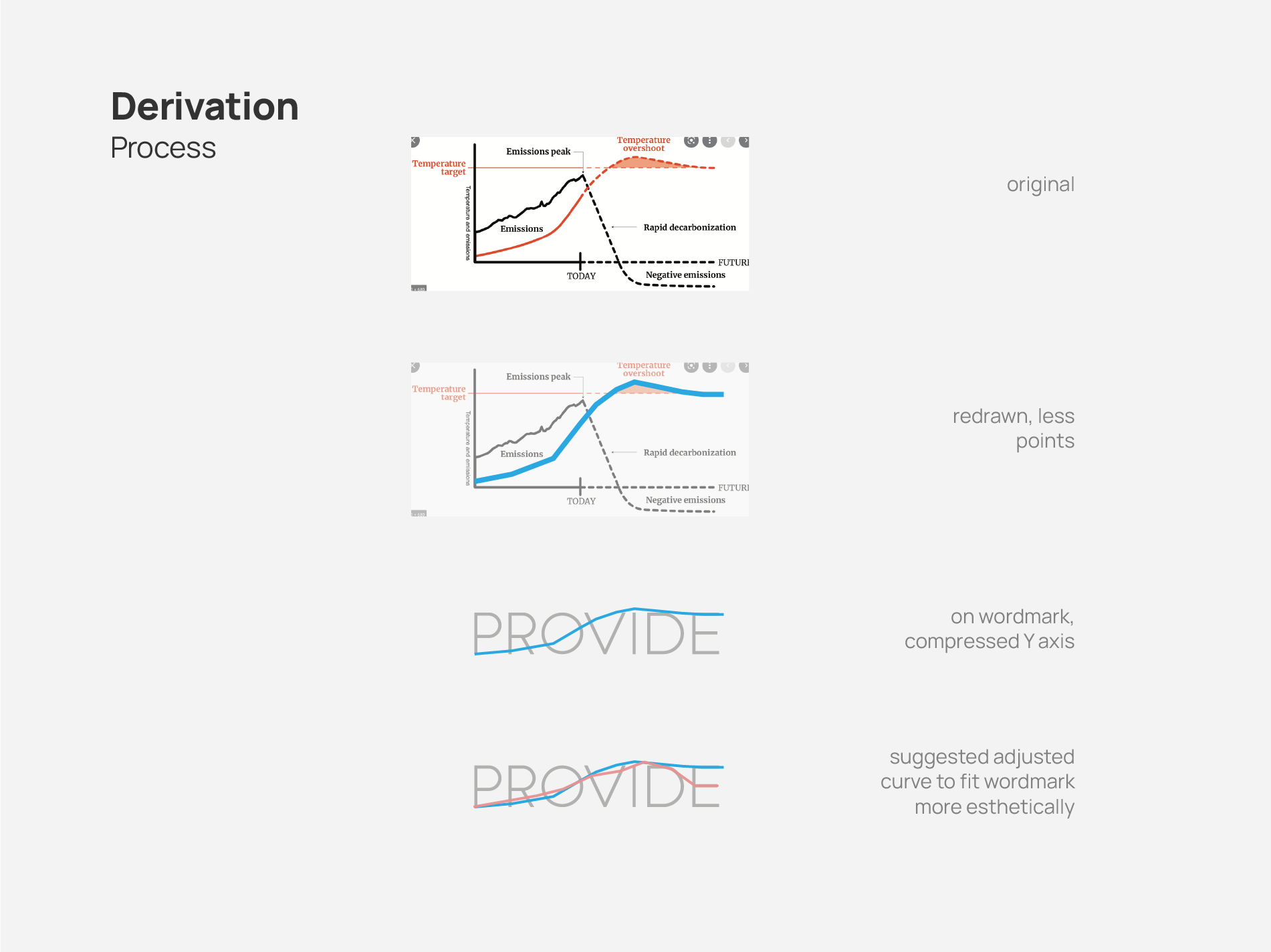
PROVIDE
The 1.5°C Paris Agreement temperature goal is the benchmark for global climate action to avoid the most devastating impacts of climate change. However, overshooting the Paris temperature thresholds is a possibility. The PROVIDE project aims to deliver information on overshoot scenarios and their impacts in the context of adaptation through an innovative web tool. It allows users to assess the risks of overshooting systemic thresholds from the local to the global level, and to make thresholds the starting point for the analysis and adaptation planning.
Logo
For the PROVIDE logo declination the briefing was very clear: The overshoot and climatic contrasts should be clear. For this we based many ideas on actual diagrams by abstracting them on some versions and slightly simplifying them on others. The final version displays an actual overshoot curve but with a compressed amplitude and dynamic width paired with a bolder font face. The "i" was used as a representation of a thermometer to accentuate the message.
Visual Identity
A project visual identity consisting of logo, typography for web/print, editable documents and a color palette was developed. A range from cold to warm colors was chosen to include the temperature aspect in the visual appearance of this project. Additionally, the aim was to find a balance between the seriousness of the topic and a visually attractive look.
Webdesign and Newsletter
Basis for the graphical details for the website, newsletter and other media was coordinate systems and curve diagrams. Especially the overshoot curve is a main component that appears in different shapes and areas. Thin and light lines give structure to the design and support a modern and clear look.


Logo designs
(Final and partially alternative artwork)